The Galaxy S7 and S7 Edge are finally here. Samsung's newest flagships stick pretty close to the Galaxy S6 formula, but they add a brand new SoC—the Snapdragon 820—and bring back some of the features the Galaxy S6 missed out on.

While we liked the Galaxy S6's overall evolution, many people saw the handset as a step backward. Galaxy S5 customers complained that "upgrading" to the Galaxy S6 would mean losing the MicroSD slot, removable battery, water resistance, and Micro USB 3.0 port. In response, Samsung has re-introduced some features from the Galaxy S5 back into the Galaxy S7. The MicroSD slot is back, as is the water resistance. The water resistance is actually improved—you'll no longer have to fiddle with the clunky, unreliable port cover to protect the S7's innards.
The device still isn't a straight upgrade for Galaxy S5 owners, though. The removable battery isn't making a comeback; it's firmly fixed in place on this latest Galaxy phone. You won't get those USB transfer speeds back either—the Galaxy S7 still has a MicroUSB 2.0 port, making it the last flagship to not upgrade to USB Type C. You're also missing out on an IR blaster, which was present on the Galaxy S5 and S6.
It's hard to nail down an exact price for the Galaxy S7 since Samsung doesn't sell it directly in the US, but the off-contract price from carriers is around $650 to $700 for the 32GB Galaxy S7 and $750 to $800 for the 32GB S7 Edge. That's a very big price tag to live up to, but let's see how it does.
Design and build quality
SPECS AT A GLANCE: GALAXY S7 & S7 EDGE
|
|---|
| SCREEN | S7: 2560×1440 5.1" (577ppi) AMOLEDS7 Edge: 2560×1440 5.5" (534ppi) AMOLED |
|---|
| OS | Android 6.0 Marshmallow with TouchWiz |
|---|
| CPU | US: Quad-core Qualcomm Snapdragon 820 (two 2.15 GHz Kryo cores and two 1.6 GHz Kyro cores)Int'l: Eight-core Exynos 8890 (four 2.3 GHz Mongoose cores and four 1.6 GHz Cortex-A53 cores) |
|---|
| RAM | 4GB |
|---|
| GPU | US: Adreno 530Int'l: Mali-T880 MP12 |
|---|
| STORAGE | US: 32GBInt'l: 32GB/64GB |
|---|
| NETWORKING | Dual band 802.11 a/b/g/n/ac, Bluetooth 4.2 GPS |
|---|
| PORTS | MicroUSB 2.0, 3.5mm headphone jack |
|---|
| CAMERA | 12MP rear camera with phase detection autofocus and OIS, 5MP front camera |
|---|
| SIZE | S7: 142.4 x 69.9 x 7.9 mm (5.61 x 2.74 x 0.31 in)Edge: 150.9 x 72.6 x 7.7 mm (5.94 x 2.86 x 0.30 in) |
|---|
| WEIGHT | S7: 152g (5.36 oz)Edge: 157g (5.54 oz) |
|---|
| BATTERY | S7: 3000mAhEdge: 3600mAh |
|---|
| STARTING PRICE | S7: ~$700 unlockedEdge: ~$800 unlocked |
|---|
| OTHER PERKS | NFC, quick charging, wireless charging, heart rate sensor, notification LED, IP68 water resistance |
|---|
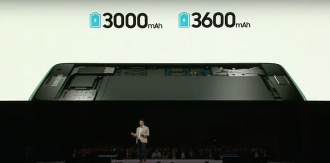
Last year the Galaxy S6 and S6 Edge launched at the same time with the same 5.1-inch screen size, but one screen was flat and the other screen was curved. This year, the curved Galaxy S7 Edge jumps up to 5.5-inches, while the flat Galaxy S7 stays at 5.1 inches. The bigger phone also comes with a bigger battery—3600mAh versus the 3000mAh battery on the vanilla S7. We assume a bunch of market research went into this, but it certainly complicates the shopping decision.
The Galaxy S7 maintains the same basic style and construction as the Galaxy S6—it's still a glass sandwich with an aluminum band. This is a style that still feels a lot better than anything from Samsung's plastic days, but it does contain twice as much fragile glass as a normal smartphone.
The Galaxy S7 isn't purely a spec bump, though. Samsung has made some tweaks to the S6 design. On the back of the flat-screened Galaxy S7, the long edge of the device is curved to fit your hand, which brings the design in line with the Galaxy Note 5. The curved sides here are less dramatic than on the back of the Note 5, but it still makes the device more comfortable to hold than the flat-backed Galaxy S6. The Galaxy S7 Edge even incorporates a slight curve to the sides on the back now, making it a little more comfortable than the sharp joint between the back and the screen on the previous model.
On the S7, Samsung has curved the perimeter of the display glass inward very slightly. It changes nothing about the feel; instead it reflects the light differently to give the device a more rounded look. The camera bump on the back has been slimmed down considerably, but it still isn't flush with the back of the device. The rest of the design looks near-identical to the Galaxy S6, save for the smaller camera hump. The Galaxy S7 is also about a millimeter thicker than the Galaxy S6—if it gives us more battery life, we are 100 percent in favor of thicker phones.
Samsung brought back the water resistance of the Galaxy S5, but it managed to do so without any of the negatives that it introduced in the older phone. The Galaxy S5 bezels were beefier than the Galaxy S4, a change that we felt made the S5 design look like a step backward. The water resistance was to blame for the S5's bezel size, but on the S7, Samsung managed to add water resistance without expanding the bezels by any appreciable amount.
The S7 also manages to be water-resistant without the annoying charging port flap of the Galaxy S5. As teardowns have shown, the waterproofing method of the Galaxy S7 is the same as the Galaxy S5—there's no special internal coating or anything, just rubber gaskets to keep the water out—but on the S7, the gaskets are inside the phone rather than hanging on exterior port covers. The Galaxy S7's USB port is exposed yet still water-resistant because of a rubber gasket blocking off the port from the inside of the phone. The SIM tray has a rubber gasket, too, while the speaker is protected with a water-repellant mesh.
An exposed USB port means the port could potentially have water in it when you go to charge it, but luckily the S7 will detect this and display an error message (rather than risk sending voltage to places it should go and frying itself or the thing you plug it into). Overall the water resistance is a big improvement over the S5. There are fewer covers and thus fewer things to go wrong. Only the rarely opened SIM/MicroSD tray needs to be sealed up.
About that USB port—it's still Micro USB Type B rather than the reversible, possibly faster USB Type C port. Samsung's choice to stick with the older, slower option this late is a bit of a shock. USB Type C's mainstream debut on the Chromebook Pixel 2 and 2015 Macbook happened almost a year ago, and Type C phones started hitting US soil almost seven months ago. Samsung is the company that fitted the Galaxy Note 3 and Galaxy S5 with a ridiculous Micro USB 3.0 port that was so early it could "interfere with data or calls" while in use. We would think a traditionally spec-sheet-focused company would be eager to adopt USB Type C, but it has made the last major flagship with Micro USB.

We'd imagine Samsung's Gear VR is to blame. The phone-based VR headset plugs into the Micro USB port on the bottom of a Samsung phone, making it compatible with the Galaxy Note 5, Galaxy S6, Galaxy S6 Edge, Galaxy S6 Edge+, and—because the port didn't change—the Galaxy S7. Changing the S7 to a Type-C plug would have required Samsung to make a new Gear VR, and we'd guess the company wasn't ready to do that. Samsung is actually offering a free Gear VR headset to every Galaxy S7 customer in the US and UK, which suggests that maybe it has an excess of Gear VR stock. Switching to Type-C would have made selling through the current stock of Gear VRs even more challenging. If you're going to buy a Galaxy S7 and can score a Gear VR for free, great! We wouldn't recommend spending cash on one with the expectation for it to last very long, though. Upgrading to USB Type-C is inevitable for Samsung, and then users will need a new Gear VR.
The one item you might miss from other flagships, or even older Samsung phones, is the IR blaster. Samsung shipped TV remote capabilities on the Galaxy S6 and S5 but left it off the S7. It's a strange omission on a device that costs a whopping $700, especially when Samsung is still including less useful bells and whistles like a heart rate monitor.
We don't really feel strongly either way about the curved screen on the Galaxy S7 Edge. It doesn't really help or harm the device; it's just one of those "because we can" features that Android OEMs are always so fond of. The curved screen does make holding the phone a little more difficult, since there's a good chance your fingers will contact the side of the screen and press something. It also distorts the sides of apps, which takes some time to get used to.
Storage sadness
The return of the MicroSD card might make you think the storage situation on the Galaxy S7 is fantastic, but there is a lot of disappointment here. If you're a US customer, Samsung is only selling the phones with 32GB of storage despite the fact that, internationally, a 64GB exists. There also isn't a 128GB version of the S7, despite the fact that the Galaxy S6 came in 128GB. Again, we're going to assume lots of marketing research went into this decision.

The other storage decision we're really disappointed with is Samsung's decision to remove Android 6.0's awesome "adoptable storage" feature from the Galaxy S7. Adoptable storage allowed you to merge the removable and internal storage into a single, unified pool of storage. After that you could forget about the SD card and store tons of apps, pictures, and video—the system handled everything. The only problem is that adoptable storage formats and encrypts the card so that only that specific phone can read it, meaning you can't swap the card to another device.
Samsung said it disabled the feature because "we believe that our users want a microSD card to transfer files between their phone and other devices." Of course, the card could still be read by a computer with a USB cable, so by "transferring files" Samsung means physically removing the MicroSD card and sticking it into a card reader. Never mind that adoptable storage is an optional feature and that users who choose to can still use their microSD cards the old-fashioned way. Samsung defends its decision. "We think that our model of using microSD for mass storage is more in-line with our owners' desires and expectations for how microSD should behave," the company said. We'd prefer that Samsung leave this sort of decision up to its users.
If you're brave, there are command line workarounds that can format the SD card to adoptable storage. But while that works now, there's no telling if a Samsung update will render your data unreadable.
The Software: Android with unwanted changes
The Galaxy S7 ships with Android 6.0.1 with Samsung's "TouchWiz" skin. This version of TouchWiz isn't a huge departure from what was shipped on the Note 5 and S6, but there have been a few changes. Most importantly, there's a theme engine to give you some control over what things look like. There are even a few semi-accurate material design options that emulate stock Android.
Android itself gives you lots of options to fix the interface, too. There's a replaceable home screen and keyboard plus Google versions of the Clock, Calendar, SMS app, and Gallery in the Play Store. Really, the most important interfaces in any OEM skin are the notification panel, lock screen, and recent apps interface, since these are pretty much the only frequently used interfaces left that aren't user replaceable.
But let's talk about the defaults on TouchWiz, since that's what most people will use. The first thing you'll notice is that Samsung's icons annoyingly take an iOS approach to their design by making every icon the same shape. Emulating iOS isn't necessarily bad, but this only happens for Samsung apps. Since every app from Google and nearly every app from a third party is going to stick with the material design guidelines and use a uniquely shaped icon, this makes the Samsung icons really clash with everything else. Luckily, you can either fix this with a theme or grab a third-party launcher and use an icon pack.
As for the important non-user replaceable stuff: the notification panel's layout hasn't changed much from past incarnations, but the default color scheme has been greatly improved, going from a teal and neon green combo on the Note 5 to a less eyeball-searing blue and white combo. Samsung adds a few extra sections to the panel, which can be turned off, and if you don't like the color, the theme engine can fix that. Recent apps has pretty much been left alone, and the only additions are a "clear all" button and controls for Samsung's multi-window implementation. The lock screen is pretty close to stock Android, too: the time, notifications, and two shortcuts.
Samsung changed the app picker and in the process removed a feature. On stock Android you can choose to open an app "Just once" or "Always," but on TouchWiz it's going to ask once and use that as the default forever. It's going to be pretty confusing for normal people since that one tap is permanent, and there's no obvious sign for users that they are making an important decision. If you want to change it, it's time to dig into the settings.
Samsung packs in a Samsung app store, a Galaxy Gear smartwatch companion app, S-Voice, S-Health, and Samsung Milk Music. The Galaxy S7 has always-on voice capabilities, but Samsung chose to give S-Voice a monopoly on the feature. You can't use "OK Google" to wake the device.
One of the new features on the Galaxy S7 is an "always-on" screen, which seems to take an idea from Motorola and make it significantly less useful. Motorola flagships (and later, the Nexus devices and most devices running Lollipop or Marshmallow) have an "ambient display" that lights up when you move the phone or when you have an unread notification. The screen displays the time and, critically, your notifications, so it's a good way to answer the question,"Why did my phone just beep?" Samsung's version doesn't do that—it displays only the time, date, and battery level, and it's on pretty much all the time. There's also an option to change the ambient display to the calendar or a color image. Seeing your notifications was the whole point of the ambient display on a Motorola or Nexus phone; Samsung copied everything but the useful part.
On the Galaxy S6 Edge, Samsung offered "Edge apps"—tall, skinny panels that took up a tiny sliver on the side of the screen. The idea was that they lived on the curve of the screen. An ever-present tab on the side of the screen allowed the user to just swipe in on the tab to access the panels and then further swipe from one panel to the next. On the S7 Edge, the panels have ballooned to take up about a third of the screen, which kind of defeats whatever weird association they had with the curve of the screen. Still, the feature is only available on the S7 Edge.
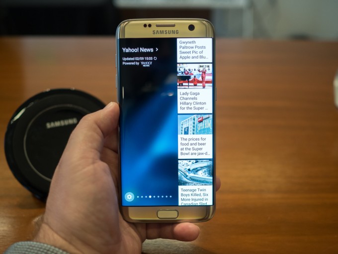
The larger Edge apps make us wonder why Samsung didn't just go for it and make them full-screen overlays. The skinny apps work well for things like app shortcuts, but they fail when it comes to "News" apps that show only two or three words per line. Samsung actually has a store up and running where developers can make Edge apps, and Samsung itself is selling some panels for cold, hard cash—$1.50 apiece. They are things like "Messages" and "Call log," though, which really seem like apps that should be packed in (especially on an $800 phone).
Performance and battery life—Exynos versus Snapdragon! Fight!
The performance and battery testing section for this phone is going to get a little complicated. US Galaxy S7s have the new Qualcomm Snapdragon 820 SoC while international S7s have Samsung Exynos 8890s. We're also dealing with two different screen size/battery combinations: the S7 with a 5.1-inch display and 3000mAh battery and the S7 Edge with a 5.5-inch display and a 3600mAh battery. That's a total of four different devices, but because we wanted to be really thorough, we have battery tests and benchmarks for all four devices!
Qualcomm introduces a new flagship by way of the Adreno 530 GPU and Spectra ISP.
The big news this year for most of the Android flagships will be an upgrade from the hot, sluggish, poorly received Snapdragon 810 to the redesigned Snapdragon 820. This isn't the case for the Galaxy S series, though, which dodged the 810 problems last year by using Samsung's own Exynos line. Despite crushing Qualcomm last year in benchmarks, Samsung is going back to Qualcomm and using the 2.15GHz Snapdragon 820 for the US-based Galaxy S7. For the rest of the world, Samsung is sticking with a 2.6GHz Exynos 8890.
The Snapdragon 810's poor performance is usually blamed on Qualcomm's rush to build a 64-bit SoC. When Apple released a 64-bit SoC earlier than anyone in the industry expected it to, Qualcomm felt it needed to rush to build a competing 64-bit chip. The fastest way to do this was to skip using Qualcomm's own CPU cores in the 810 and use ARM designs, specifically the Cortex A57 and A53. Samsung's Exynos used the same architectures, but its chip was manufactured on the company's 14nm process, while the Snapdragon 810 used an older 20nm TSMC process.
On paper, the 820 should do away with these problems. Qualcomm is said to have switched to Samsung for manufacturing, allowing it to be on the same 14nm process as the Exynos chips. Qualcomm is also back to using its own CPU cores with this generation, called "Kryo." New CPU or no, the Galaxy S7 will get pretty toasty during big workloads. Samsung actually built a custom heat pipe cooling solution to dump as much of that heat as possible.
The Snapdragon 820 is a quad-core chip, and—while we're not quite sure of the branding—Qualcomm is still using an idea similar to ARM's big.LITTLE design. The big.LITTLE SoCs use slower, low-power CPU cores for background and idle work and faster, more power-hungry cores for when it's "serious computing" time. On the Snapdragon 810, these cores have different architectures, but in the 820 you get four Kryo cores with different max clock speeds: the two "big" cores run at 2.15GHz while the two "little" cores max out at 1.6GHz. AnandTech reports that, in addition to clock speed, the cores differ slightly in cache configuration. The 820 is "only" four cores, though, so don't expect it to run away with the multi-core benchmark when fighting against the eight-core 810 or Exynos 8890.
Internationally, the Galaxy S series is upgrading from Exynos to Exynos—specifically from the Exynos 7420 in the Galaxy S6 to the Exynos 8890. Like previous Exynos, this is a 14nm chip with an eight-core big.LITTLE design. For the "big" CPU cores, the Exynos 8 line switches from an ARM CPU to a custom Samsung architecture called "Mongoose." The four "little" cores are still Cortex A53 running at 1.6GHz, while the Mongoose cores run at 2.6GHz. For the GPU, Samsung is still going with an ARM design: the Mali-T880.
The Exynos 8 line is also Samsung's first SoC with an integrated LTE modem, which saves it from having to stick a separate modem chip on the motherboard. It supports download speeds of 600Mbps and upload speeds of up to 150Mbps, which equals the Snapdragon 820's X12 modem.
Getting down to benchmarks, the TL;DR version is that the two SoCs were both about even in our tests. The only real separation was that the eight-core Exynos beats the four-core Snapdragon in Geekbench's multi-core test.
There's really no point in showing both the Galaxy S7 and S7 Edge—they perform identically. So wherever you see "Galaxy S7," think "Galaxy S7 and Galaxy S7 Edge." The real fight is in the Qualcomm Snapdragon 820-packing Galaxy S7 (US) and the Exynos 8890-equipped Galaxy S7 (Int'l). Also pay attention to how well the Snapdragon 820's single-core scores stack up to the much-lauded Apple A9 in the iPhone 6S and 6S Plus—Qualcomm isn't quite on the same level, memory bandwidth aside, but it's a huge step up from ARM's Cortex A57 design.
Will sticking with the same formula be competitive enough?
The S7 is a fine upgrade. Samsung has taken some of the more dearly missed features from the Galaxy S5 and integrated them into the Galaxy S7 while boosting the specs to the latest Qualcomm SoC. It's also a formulaic upgrade, coming at a time where a few companies are trying to shake up the existing cookie-cutter smartphone design and pricing structure.
We've learned to never underestimate Samsung's marketing machine, but today it feels like the Galaxy S7 has more competition than ever. Of course, there is the ever-present competition from Apple, but this year Samsung also has to do battle with an innovative LG flagship, the G5. Other than the water resistance, the LG G5 matches almost everything the Galaxy S7 is doing. It upgrades the glass body to an all-around superior metal build, adds USB Type C, and adds an innovative modular accessory system along with a removable battery. Internationally there's also Xiaomi, which is building pretty much the same hardware as Samsung in the form of the Mi 5 Plus. That phone only costs $350 instead of the $700 Samsung is charging.
Upgraders from the Galaxy S5 will still lose a removable battery, higher storage tiers, an IR blaster, and USB 3.0 transfer speeds. When you're asking people to pay $700, it's really hard to justify leaving out any features, especially at a time when the price for "flagship"-level phones seems to be falling. Nexus phones, Motorola, OnePlus, and Xiaomi are lowering the price bar while Samsung would really like to stay put (though it should be noted that Samsung is still the most profitable of the Android OEMs by a sizable margin).
The Galaxy S7's real strength will be its scale and marketing. The Galaxy S7 is going to be everywhere on TV and in every carrier and electronics store, and for that reason it will be successful. People that go and ask their local Verizon salesperson what to buy will be pointed to the Galaxy S7, but if you're comparing specs and features via reviews like this, the smartphone world has more to offer.
The Good
- The curved sides on the back make the device a little more comfortable to hold.
- The S7 brings back all the advantages of water resistance with none of the negatives present in the S5.
- The default app designs aren't bad, but if you don't like them, a trip to the theme store can change things up.
- Gear VR compatibility—Samsung and Oculus are building a great mobile VR ecosystem, and only Samsung phones are compatible.
The Bad
- Glass is still fragile. We'd prefer metal on the back.
- SD cards are better than ever with Android 6.0's adoptable storage, but Samsung killed the feature.
- No always-on "OK Google" support. The capability is here, but Samsung limited it to S-Voice only.
- Samsung's "always on display" copies Motorola's "ambient display" but omits the entire reason it was useful—notifications.
- Micro USB 2.0 means Samsung customers will have to wait another year to upgrade to Type C.
- No IR blaster. It was present on the Galaxy S6, but it's not on the S7.
- Samsung's slow software update cycle.
The Ugly
- US customers only have access to the bottom tier of storage—32GB.
 I think the Galaxy S7 series are fantastic phone. From the above picture, we can see, the Galaxy S7 Edge is slightly bigger than the S7 but its curves make it feel smaller than it is. And this time the micro SD card slot is back! It is a winning one.
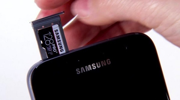
 I think the Galaxy S7 series are fantastic phone. From the above picture, we can see, the Galaxy S7 Edge is slightly bigger than the S7 but its curves make it feel smaller than it is. And this time the micro SD card slot is back! It is a winning one.
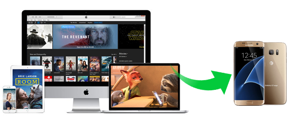 Samsung Galaxy S7/S7 edge supported video format and codec : MPEG4, H.263, H.264, DivX, DivX3.11, VC-1, VP8, WMV7 / 8, Sorenson Spark, HEVC.
 Samsung Galaxy S7/S7 edge supported video format and codec : MPEG4, H.263, H.264, DivX, DivX3.11, VC-1, VP8, WMV7 / 8, Sorenson Spark, HEVC.
 3. Choose MP4 as output format. Click on the profile panel to open the output setting window. Here you can choose Same as source for mp4 as output format. Note: You can also click the android icon and find the Samsung galaxy series option. M4V Converter Plus can support converting iTunes videos to the android phone and other mobile tablets.
  4. After all settings done, click Convert button to start iTunes movies to Galaxy S7 conversion.
 3. Choose MP4 as output format. Click on the profile panel to open the output setting window. Here you can choose Same as source for mp4 as output format. Note: You can also click the android icon and find the Samsung galaxy series option. M4V Converter Plus can support converting iTunes videos to the android phone and other mobile tablets.
  4. After all settings done, click Convert button to start iTunes movies to Galaxy S7 conversion.
 My iPad kept telling me that I was not authorized to view content when I tried to watch 2 rented movies. I connected my iPad to iTunes and needed to completely restore it for some reason. Now, I've lost the 2 movies I rented and have yet to watch. How do I re-download the movies. I've gone to my account and they don't appear anywhere. --Asked by bigalwood on


 While we liked the Galaxy S6's overall evolution, many people saw the handset as a step backward. Galaxy S5 customers complained that "upgrading" to the Galaxy S6 would mean losing the MicroSD slot, removable battery, water resistance, and Micro USB 3.0 port. In response, Samsung has re-introduced some features from the Galaxy S5 back into the Galaxy S7. The MicroSD slot is back, as is the water resistance. The water resistance is actually improved—you'll no longer have to fiddle with the clunky, unreliable port cover to protect the S7's innards.
 We'd imagine Samsung's Gear VR is to blame. The phone-based VR headset plugs into the Micro USB port on the bottom of a Samsung phone, making it compatible with the Galaxy Note 5, Galaxy S6, Galaxy S6 Edge, Galaxy S6 Edge+, and—because the port didn't change—the Galaxy S7. Changing the S7 to a Type-C plug would have required Samsung to make a new Gear VR, and we'd guess the company wasn't ready to do that. Samsung is actually offering a free Gear VR headset to every Galaxy S7 customer in the US and UK, which suggests that maybe it has an excess of Gear VR stock. Switching to Type-C would have made selling through the current stock of Gear VRs even more challenging. If you're going to buy a Galaxy S7 and can score a Gear VR for free, great! We wouldn't recommend spending cash on one with the expectation for it to last very long, though. Upgrading to USB Type-C is inevitable for Samsung, and then users will need a new Gear VR.
 The other storage decision we're really disappointed with is Samsung's decision to remove Android 6.0's awesome "adoptable storage" feature from the Galaxy S7. Adoptable storage allowed you to merge the removable and internal storage into a single, unified pool of storage. After that you could forget about the SD card and store tons of apps, pictures, and video—the system handled everything. The only problem is that adoptable storage formats and encrypts the card so that only that specific phone can read it, meaning you can't swap the card to another device.
 The larger Edge apps make us wonder why Samsung didn't just go for it and make them full-screen overlays. The skinny apps work well for things like app shortcuts, but they fail when it comes to "News" apps that show only two or three words per line. Samsung actually has a store up and running where developers can make Edge apps, and Samsung itself is selling some panels for cold, hard cash—$1.50 apiece. They are things like "Messages" and "Call log," though, which really seem like apps that should be packed in (especially on an $800 phone).
 Qualcomm introduces a new flagship by way of the Adreno 530 GPU and Spectra ISP.
 e offers video files for sale and rent. The store’s page for each program or film has details on what options are available for buying or renting, along with the prices.
 After opening the M4V converting program, iTunes will open automatically. . Click on Add Movies button, it will pop up the adding window, now you can select iTunes movies you want to convert.
 Next, you can customize the added movies: rename the movie, get specific segment from the big movies.
 Before conversion, you should select the video format you want to get. As was mentioned above, you can convert iTunes M4V videos to common video formats like MP4, MOV. You also can choose the mobile device according to you own.
 All settings finished, you can start the conversion progress by hitting Convert button.